Posted on 1 Comment

Sedona

Hi, gang. I know it’s been a while since I checked in, but it’s summer and I have even less bench time than usual. But it’s summer! And it has been so mild and beautiful. What better time to think about fall?

Here’s what’s on my bench…  (It’s Bead Table Wednesday.)

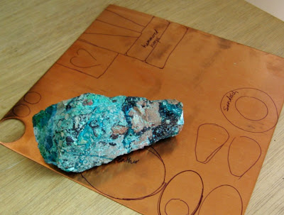
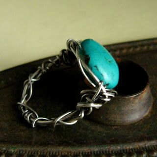
Copper and turquoise.  No, that’s not turquoise, but it was sitting with my photo props and is making its internet debut.  I actually don’t know what stone it is; I inherited my great aunt’s rock collection and I think it was in there.  She used to polish her own cabs — very cool.  I remember digging through her dops and tumbled rocks and such when I was a little girl, which probably planted seeds for my love of making jewelry.

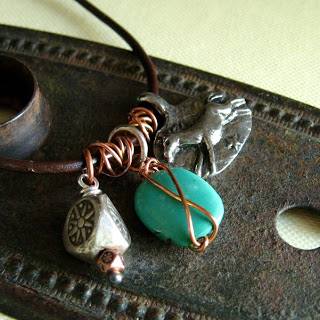
Anyway, what is the copper part of that picture?  I don’t take time to do a lot of sketch-planning in my jewelry making, but I did sketch out some things to cut out and hammer and play with for my fall line, which I’m calling Sedona.  I’m planning to use hammered copper, plenty of turquoise (and other teal things), some verdigris patina on copper, and oxidized silver.  Like this…
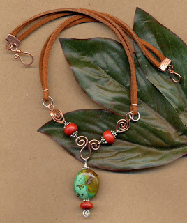
 

Leather, copper, sponge coral, turquoise, c. 2007

Alas, my studio is across the hall from my sleeping kids so I haven’t done much hammering lately.  It forces me to plan more, which is a good thing.
Posted on 2 Comments

Color inspiration

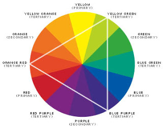
Do you ever get in a rut with color?  For me I get stuck on robin-egg blue for spring, and burnt orange in fall.  The color wheel is just not that inspiring for me, so if you told me to use a triadic color scheme I wouldn’t get much beyond this.

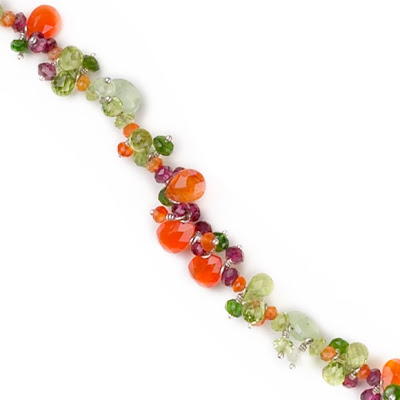
Bright orange, purple, and green.

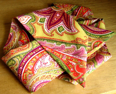
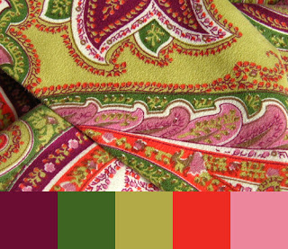
Sometimes I just have to see just the colors in question together to get excited about it, and sometimes it takes a version of the color to inspire me, like coral instead of bright orange.  Today (ahem, during the sermon at church) I couldn’t stop staring at my paisley belt.  I never would have put plum, olive, sage, salmon, and orchid together but it totally worked.  And look!  It’s almost the same triadic combination, but a springy fresh version of it.

And then I was thinking about how the jewelry version of the belt would be something from Laura Gibson.

Brandi Hussey is a whiz with color and has written a tutorial on how to use a picture to create a color palette in Photoshop.  So I tried it.

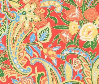
When you’re looking for new color combinations, take your camera to a store that sells fabric or fine stationery.

Notecard from PaperSource

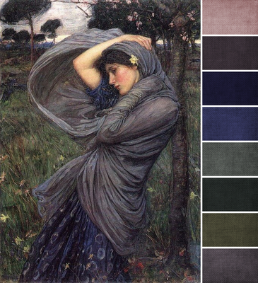
Or find a fine art image, like the monthly challenge over on Art Bead Scene.

And then make a palette from it, even if you just do it in your head.  And then make jewelry that incorporates colors from that palette.  Mix some colors and don’t worry about the rules!

Update:  Molly has a great suggestion down in the comments (Thanks!):
May I also suggest using this amazing tool from Sherman Williams for creating a color pallet from any image. It’s called Chip It! And you can add it to your tool bar just like the Pinterest “Pin It” button. You can check it out here: http://letschipit.com  It is a designers dream!!

Posted on

Bargain hunting with gold and gemstones

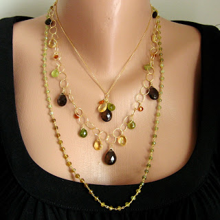
Last week I took a grouping of my Facets collection to the shop downtown, and in looking back over the pictures a few thoughts occurred to me.  High-karat gold and rich, faceted gemstones are really popular right now, even in the tough economic times and sky-high metals market.  But I’m too much of a bargain hunter to settle for jewelry designs that cost “a million dollars.” (That’s my phrase for when something is ridiculously expensive.)  Last year I introduced gold-filled (a heavy layer of gold over base metal) components as a price-savvy alternative to solid karat gold, and this past year with the gold market even higher I have found even more economical-yet-fashionable solutions. 

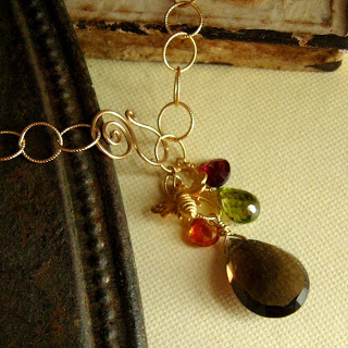
I buy stones according to color because my customers are more concerned with the look (Will this match my sweater?) than the pedigree (Is this garnet A-grade?).  For this necklace I could pay top dollar for flawless, earthy green briolettes (A-grade peridot, for example) but I chose cubic zirconia to go with the fall mix of citrine, rhodolite garnet, and smoky quartz.  And if a stone has a small inclusion it’s not like the Gem Police are going to be up in your grill examining as one might, say, an engagement solitaire.  So while this may not be a necklace passed down for generations, it does have the color and wear of real gold and the weight of real stones.  (Ever have the full-on Monet experience at big retailers?  It looks beautiful until you hold it and realize the beads are plastic.)
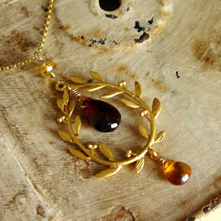
I have previously drawn the line at gold-plated components because they’re generally cheap looking anyway, and because of the thin layer of gold they’ll tarnish much sooner.  But lately I’ve put a lot of work sourcing components to get the look of high-karat gold without the pedigree, as with this laurel wreath.  It is matte 16K gold-plated brass and, while I know it’s not going to wear as tough as gold-fill, it’s in a low-traffic setting (pendant) and a heckuva lot less expensive than solid 18K gold.  And that sweet little bee in the necklace above is vermeil — 18K over sterling silver — so it also has intrinsic value without the price tag of solid gold.  Again, these may not become estate pieces, but that also means you don’t have to love them forever.  (I love yummy soft leather handbags but I never buy them because then I’d feel obligated to carry/repair/love the same bag until I’m 60, and I’m too fickle for that.)  So for $39 you get the actual color of high-karat gold along with real citrine and garnet in rich tones for fall on a gold-filled chain.

These pieces (N791, N806) are used for illustrative purposes, but may still be available at Simply Charming Boutique.

Posted on

Playing with Polymer

People often ask me how long I’ve been making jewelry, which usually requires a follow-up question like, “How long have I been making jewelry like I make now?” 


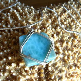
You see, when I was a kid my parents wouldn’t let me get my ears pierced, so naturally I was fixated on what I couldn’t have. Using my dad’s tools I would bend telephone wire, gleaned from a construction site, into little clip-on earrings.  I had turquoise ones and yellow ones and I didn’t care how ugly or dirty they were.  Later I found some kidney-wire earrings at a craft store and clipped them upside-down to my lobes because it looked like the end of the wire was going into my ear like a real earring.  Hot stuff!  Add to the mix my great aunt, who mined and polished her own stones and got me interested in rock tumbling, and I was a full-on jewelry nerd.  I got really good at wire-wrapping those slippery tumbled stones to make pendants, though, so now wrapping sea glass is second nature. My friend Jenny, whom I’ve known since 6th grade, recently asked me to wire-wrap this piece of larimar, and (kindly) noted that I’ve come a long way since my rock tumbling days. 


What were we talking about?  Oh yeah, polymer clay.  Also during my middle school years I got a sampler pack of Cernit clay at a train show (my Dad is into model trains).  Soon I got into polymer clay (sounds like I’m dabbling in drugs) and would read Nan Roche’s The New Clay like it was my job.  I worked with polymer clay on into high school and thought it was really cool to make earrings as miniature versions of the designs in special outfits.  That’s when I got started with beads, too, back before internet shopping.  So when I say I’ve been making jewelry since I was a kid, my products back then are not what I consider lovely today.  I haven’t any examples to show you, although my mother still wears her vintage AnneMade Jewelry to my chagrin.
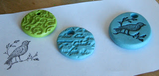
These days (meaning now that I have a jewelry business) after I have a chance to recover from the holiday season of making and selling jewelry and all our Christmas festivities, it’s usually the dead of winter and I get a yearning for spring.  I do have to work ahead of the season, so it’s not unusual for me to use delicate pastels and beachy brights at this time of year.  I’ve been itching to play with polymer clay again and make some pendants for spring.  And I love that my original sampler pack of Sculpey is still as good as it was 20 years ago.  Polymer clay has come a long way since then, including the development  stronger formulas, liquid clay, and surface techniques like mica shift.  I have always been too cheap to invest in a pasta machine, but today I realized that hand-kneading clay takes forever. 
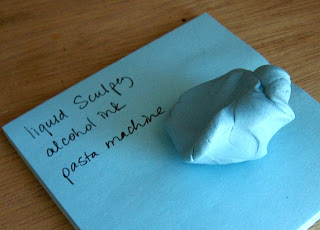
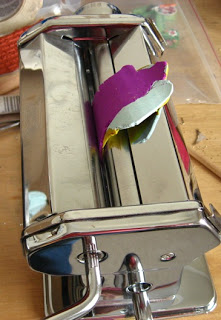
(I think it’s funny that my clay turned out the same color as the shopping list I created while kneading it. Love this color!)  So yesterday I printed out a Michael’s coupon and headed there as soon as Olivia woke up from her nap. I also found treasures in the stamping aisle (alcohol inks to color liquid Sculpey, dye ink pads for rubber stamping, clear stamps so you can see what you’re doing).  And what a difference the pasta machine makes!  It’s like a mini rolling mill, in fact I could run texture through with the clay.  Once I knead the clay to get it soft, mixing colors on the machine is so easy.  And after working with PMC so much, it’s so great not to have to worry about a piece drying out on me.  If I don’t like it I just ball it up and try again.  I do have to worry about foreign particles, though, because I’m not firing this clay in a kiln like PMC.  (Side note: PMC people, if you’re looking for Teflon paper to use as a work surface, Michaels has it in the stamp/ink aisle.)

Another creative chapter in my past is painting.  If you come to my house I may not point them out, but several of the pictures on our walls are watercolors and drawings I did in high school.  And if you’ve ever worked with oil paint (or acrylic) you’ll know the concept of color saturation.  A tiny dab of alizarin crimson or titanium white is all it takes to affect the whole glob of paint because those colors are so saturated.  Same goes with certain colors of polymer clay, so if you’re just starting out remember to mix in only a little bit of a new color at a time.
I view the Pantone season forecast a little like I view the Farmer’s Almanac.  Does anyone ever look back and grade them on how accurate they were, or do we just trust them?  I live in a small town out in the country, so we’re a little behind the style trends anyway, so I tend to just use what I like.  Right now it’s orchid.

Did it again! This ballet pink pendant matched another Post-It. Maybe I need to get my fashion forecast from 3M.


Posted on

Purple, Pink, & Orange

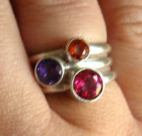
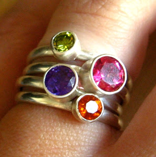
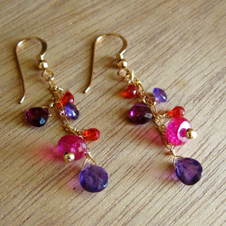
I’ve mentioned before how I’m currently enamored with the look of purple, pink, and orange together.  It all started with something I saw in San Francisco.  I got the idea to make a set of stacking rings with these colors and (in the middle of the night) scrawled a sketch on our hotel memo pad.  That was back in March, and I finally took the time to make them.  Pink topaz, mandarin garnet, amethyst, and an olive green CZ as stacking rings so I can mix and match depending on my mood.  The inspiration piece was 18K gold, which is really pricey right now, so I’m compromising by sending these to be matte vermeil’ed. 

Posted on

Facets at Simply Charming

I posted photos of the initial members of my Facets line, heading shortly to Simply Charming Boutique.  Once I started working with gold again it made sterling seem kind of boring, so there are more gold pieces than silver.  Maybe it’s because gold is just perfect for fall and I have a hankering for cool weather and crunchy leaves.

The Facets collection includes genuine faceted stones like garnet (grossular green, brown hessonite, traditional almandine, pink rhodolite), citrine (both pale and topaz-y deep), burnt orange carnelian, amethyst, apatite, iolite, smoky quartz, and did I mention gold!

I used a lot of gold-fill components, which is a heavy layer of 12-14K gold over a base metal core.  It has the look and durability of 14 karat gold without the $1,297/oz price tag.  I also used some vermeil (ver-MAY), which is a sterling silver base heavily plated with high-karat (18-22K) gold so it is solid precious metal and has that rich yellow color like museum jewelry.  I love the way it looks with pink, orange, and purple.

Simply Charming Boutique has reopened in its new location (with free parking) and I can’t tell you in words how BEAUTIFUL it is!  My jaw dropped open when I first walked in, partly because it’s an old building with wonderful architectural details, and partly because Brenda has filled it with all kinds of wonderful things.  Go have a look if you’re near Winchester, Virginia!

If you’re not lucky enough to be in the Shenandoah Valley but you want to get details about the pieces, feel free to email me for pricing and availability of any items in the Facets or Elements collections, or you can check out the rest of my jewelry at my Etsy shop.

Posted on

Facets Collection

Now that my Elements collection is having fun in its new home my jewelry-making is now geared toward another new collection called Facets. 

Where Elements is rustic, neutral, and casual, Facets is bright, sparkly, and colorful.  I intend for the pieces to work together to make a layered look, or to be worn separately based what you’re wearing.

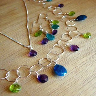
Pictured here is a 20″ sterling bubble chain with amethyst, peridot, and apatite.  It can be paired with the amethyst solitaire pendant on an 18″ chain and the cluster earrings.  Or if your top has a lot going on you could do just the earrings or solitaire. 

As with the Elements collection, I challenged myself to create pieces that embracing the current economic climate; interesting without breaking the bank.  Just because you see gold and faceted stones, don’t expect to pay a million dollars for them.  I love to bargain hunt, even with beads.

Posted on

Color

My Elements collection is well underway, so I’ve moved from production mode to pricing/tagging mode.  Ugh.  Not my favorite part, so the procrastinator in me looks for something fun for distraction.  Another line! 
My Facets collection is next so I’ve been in purchasing mode shopping for faceted stones and chain.  It’s taken me awhile, but I’m embracing gold again.  I’m planning to have both silver and gold and colorful stones like peridot, amethyst, citrine, garnet, and maybe some Swarovski crystal to fill in where nature is either lacking or cost prohibitive.  On Friday I got to visit one of my favorite places, Sparkles Bead Shop in Newark, Delaware.  Connie, the owner and my precious friend, walked me through the new Swarovski colors, and just standing in front of a halogen-lit wall of sparkling facets was so inspiring.

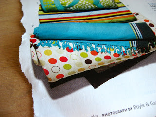
One part of working with color that is not my strong suit is putting different colors together.  When I get dressed in the morning and choose a colorful shirt, I wear neutral pants (or my beloved green capri pants with a neutral shirt).  That’s a color cop-out, especially when I love how other people put bright colors together.  So I’ve learned little tricks that help me out, like looking at a non-jewelry item to get inspiration.  When I go to the fabric store and don’t really need anything, I’ll walk around and look at color combinations used in the fabrics.  Pictured here is pile of picnic blankets I saw in Parents Magazine. (When I joke that I never really leave work, I’m not entirely joking.)     
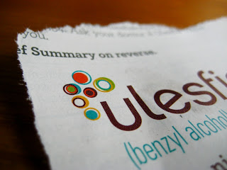
I do the same in the scrapbooking section because those color combos tend to be a little more contemporary.  Also in that magazine was this ad for lice medication, but here is the part I saw: turquoise, avocado, burnt orange, chocolate, mustard.  I’m drawn to circle motifs, but I’m training myself to be in “color mode” these days.
I’ve had a break and let myself get distracted while still being productive, so now I’ll go back to the grindstone and finish pricing and tagging Elements.  I’m planning to put a gallery page up so people outside the Shenandoah Valley can see what’s new, too.  Will keep you posted!